
Beyond Anthracite – Choosing a Window and Door Colour That Actually Stands Out
Anthracite grey has had a long run. It started on bi-fold doors at the back of kitchen extensions, moved onto window frames and front doors, and before long it had reached the guttering, the garage door and the fence panels too. For a lot of projects it stopped being a colour choice and became the default.
It made sense at first, because grey worked as a contrast. On a street of white uPVC, a grey-framed house looked considered and a bit more architectural. The first grey house on the street stood out.
That first house is now the fourth, the seventh and the eleventh. Once everyone makes the same distinctive choice, it is not distinctive any more, and anthracite has become the safe pick for people who are not really picking a colour at all.
So if you are specifying windows or a front door for a customer who wants something different, or choosing for your own project, where do you go from here?
Heritage shades are the new contrast
The strongest move away from grey is, oddly enough, a step back. Softer heritage tones such as greens, warm off-whites, muted blues and softer blacks are doing now what anthracite did a decade ago. They tend to sit well against brick in a way cool grey often does not, and they bring a period feel that reads as character rather than trend.
That is why heritage colours and flush casement windows so often turn up together. A heritage colour on a flush casement frame looks coherent, because the profile and the colour are telling the same story. The same shade on a chunkier lipped frame only gets you part of the way. If a customer is going heritage on colour, it is worth talking them through a heritage frame style as well.
Woodgrain without the wood
The other way out of flat grey is texture. Our windows can be specified in a smooth or grained finish, and a woodgrain-effect frame brings a warmth and depth that a flat colour cannot match, without the sanding and repainting that puts people off real timber. On a cottage, a barn conversion or a stone property, a woodgrain frame usually looks more at home than a flat modern colour.
There is a middle ground too. A grained finish in a modern tone keeps the contemporary look but loses the flatness, and the flatness is often the thing people dislike about a street full of anthracite, even if they cannot quite say why.
Two colours are better than one
One of the most overlooked options is that the inside and outside of a frame do not have to match. With a different colour on each face, you can run something bold on the outside and keep a clean white inside. Any risk of the colour dating stays on the outside of the glass, and if tastes move on in ten years, the rooms inside are unaffected. It is an easy sell for an installer to a customer who likes a colour but is nervous about committing to it.
You can check which inner and outer combinations are available on each product in the configurator.
The front door is the easy win
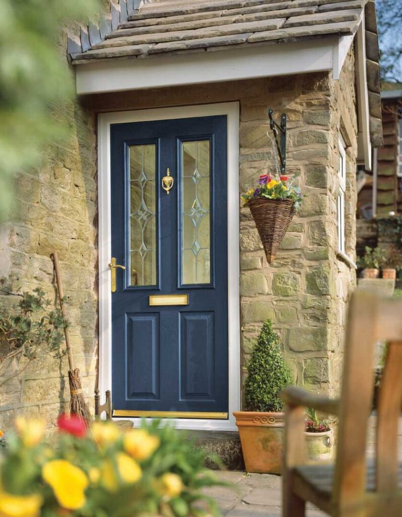
If changing the whole elevation feels like too big a leap, the front door is where colour costs the least and makes the biggest difference. A deep green, a rich red or a dark blue against neutral frames will lift the front of a house more than another all-grey scheme. Our composite doors come in all three, alongside black, white and grey.
The simplest rule for a front door colour is to choose the shade that suits the brick and the light on that particular house, not the one from the new-build brochure three streets away.
Choose a colour on purpose
None of this means anthracite is a bad choice. On the right house it still looks sharp. The point is that it stopped being a decision, and the houses that stand out now are the ones where someone picked a colour deliberately.
We supply uPVC windows from REHAU and Sheerline, along with composite doors, all made to measure on a supply-only basis at trade prices. The windows come in a smooth or grained finish, and every frame is specified through the online designer, from colour and finish to the inner and outer faces. You can see how different colours look on real properties in our gallery.
Design and price yours online, and if you want a second opinion on a colour before you commit, get in touch and we will talk it through.